Objective
A once nameless entertainment company recruited me to join their organizational/biz-ops team to lead their company's branding initiative. This initiative included two main tasks:
(1) Find a name that captures the spirit of the company and (2) create a logo that is appropriate for the context, memorable, and simple so it works at any scale.
The Process
I began this process by taking time to ask the team questions. Since I had just recently been brought on board, there was much to learn about the company. Some questions I asked were:
How would you like your company to look?
How would you describe it?
What attributes would you assign to your brand?
What are some examples of other brands that you would attribute these descriptors to?
How would you describe it?
What attributes would you assign to your brand?
What are some examples of other brands that you would attribute these descriptors to?
I asked the team to narrow down their descriptors to 5 key words that they would want their brand to be associated with or described as. The 5 key words they chose were modern, dependable, passionate, connected, and virtual.
The team and I looked at similar/competing brands in the industry and took note of what was liked and disliked about these brands and then I dived into more research on the design trends of similar companies, as well as companies that aligned with the descriptors they chose for their own company.
Here are some notes I took on what design attributes I associated with their chosen words:
Modern: san serifs, simplicity, sometimes shine (Look at: Hulu)
Dependable: importance on copywriting, bold look (Look at: Subaru, Nintendo, Google)
Passionate: bright/happy colors, custom feel, texture, overlays, stamps
Connected: importance on copywriting
Virtual: bold, intentional strokes, sharp edges/boxes/points
Dependable: importance on copywriting, bold look (Look at: Subaru, Nintendo, Google)
Passionate: bright/happy colors, custom feel, texture, overlays, stamps
Connected: importance on copywriting
Virtual: bold, intentional strokes, sharp edges/boxes/points
When it came to the search for a fitting name (that was also available), the road was long and winding. Many names were considered, such as Devise Studios, SortaWorks, and District Wonder. (If you're interested in seeing the logos made for these and other contenders, you can check out the Logofolio page!) The name that ended up being selected, as you may have already guessed seeing as how it's the title for this page, was Arcvale.
Once the name was selected, I was able to go ahead and create mood boards and concepts for the logo design.
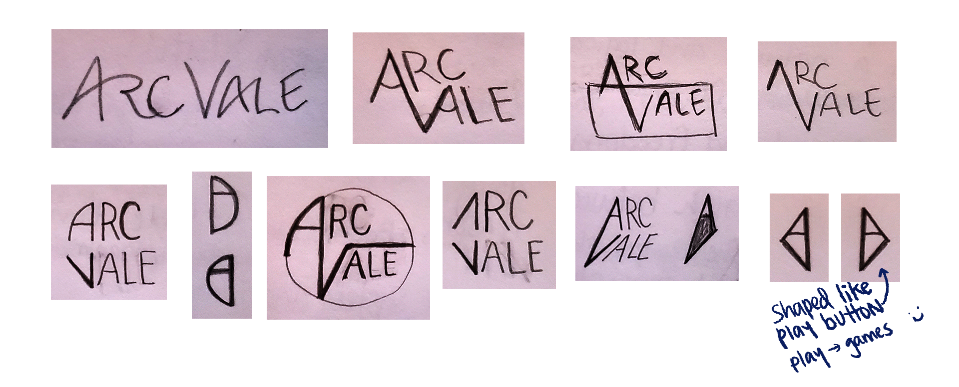
After sharing some concepts with the team, we narrowed the direction down a bit more through discussion, and I went back to designing.
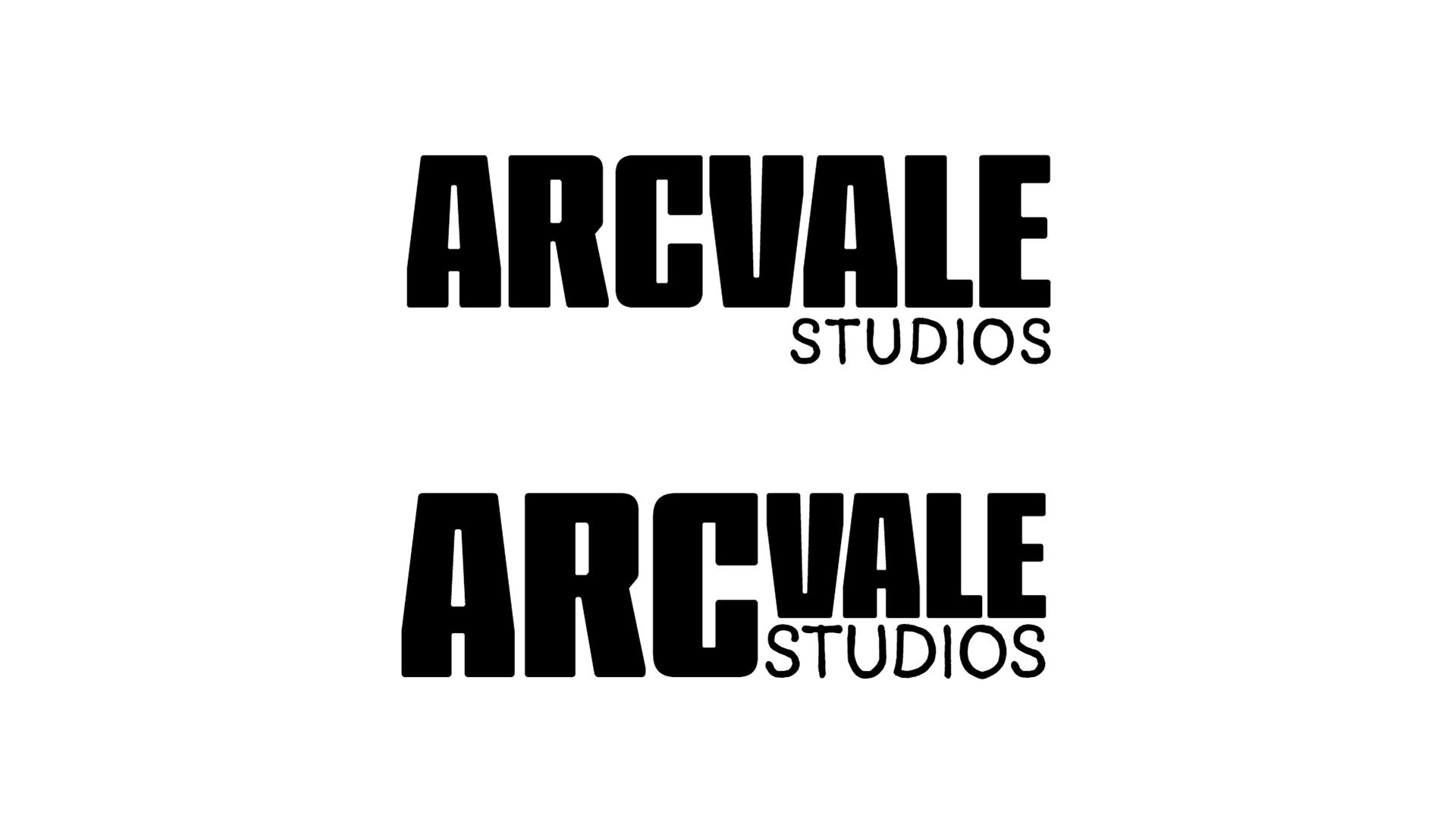

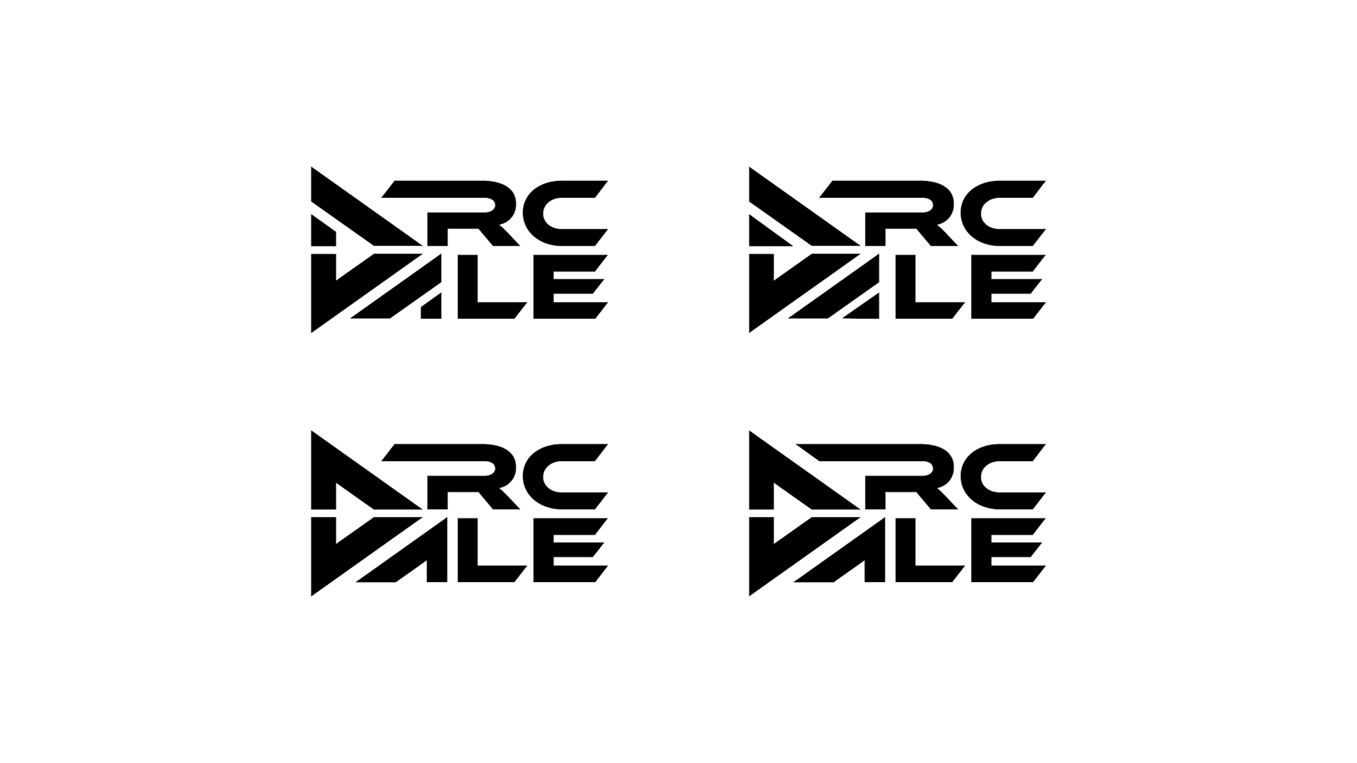
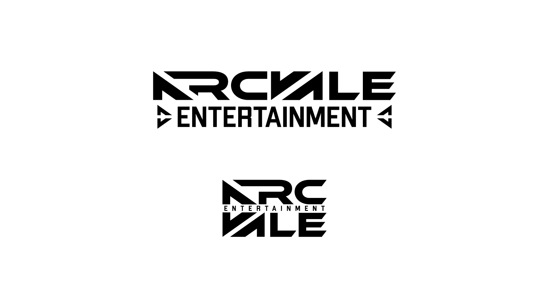
The team really enjoyed the play button concept, however they feared that the readability was lost in the design. As a new company readability is important. As a result, we moved away from this design in future iterations until we came across the winner.
The Result
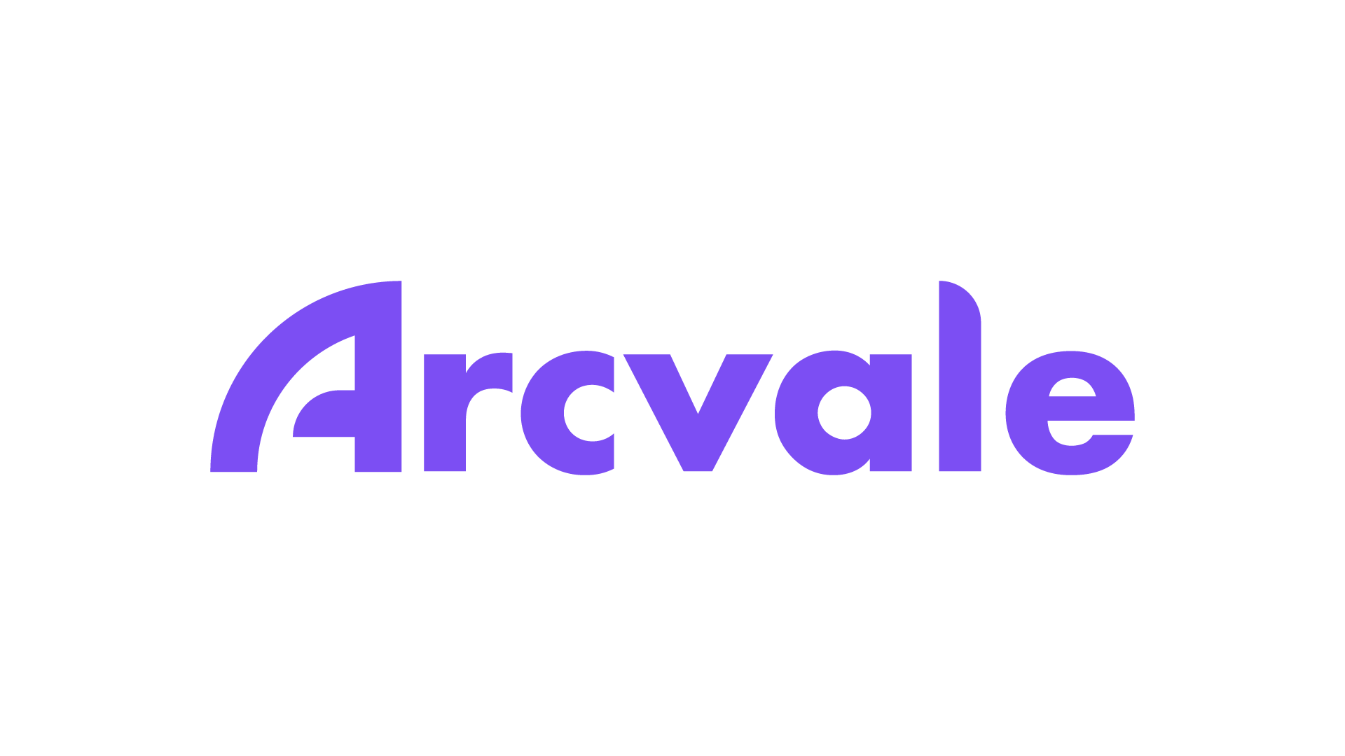
Arcvale Logo, White BG
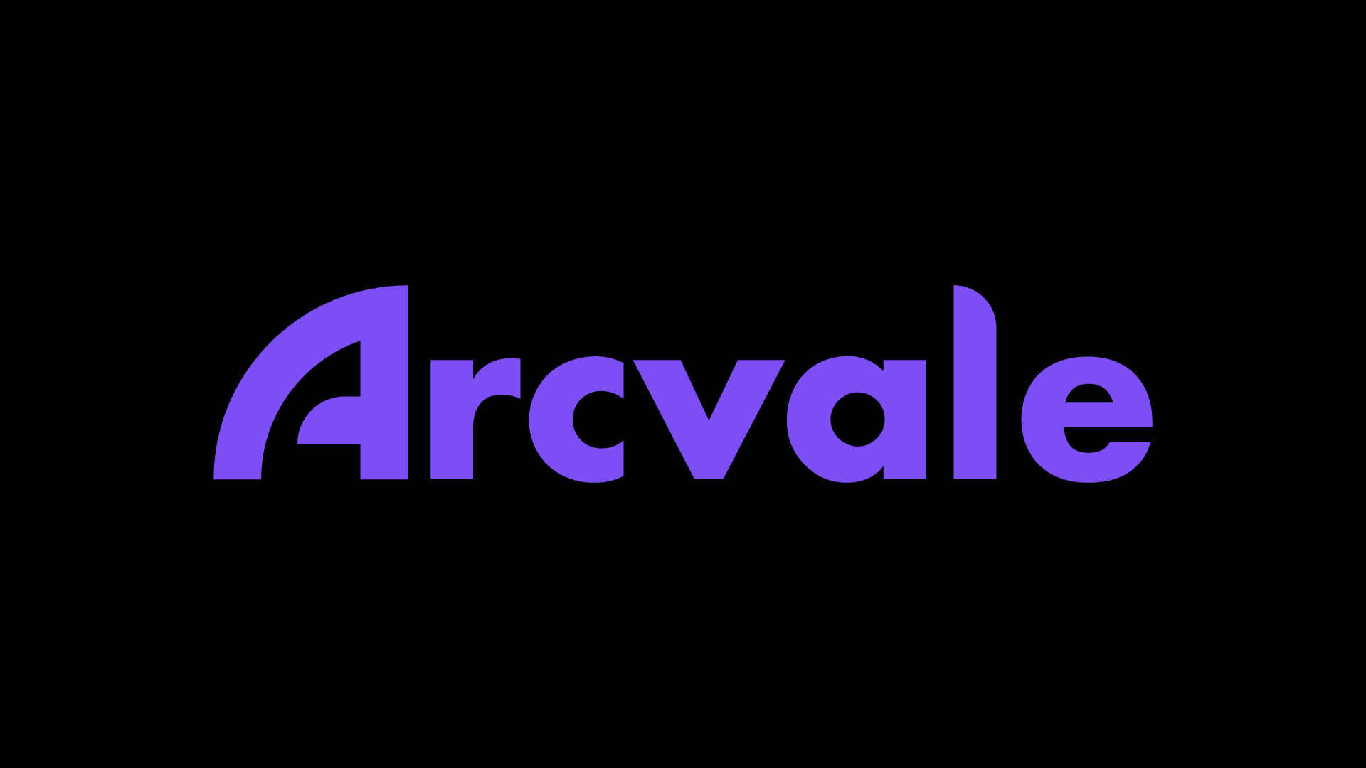
Arcvale Logo, Black BG
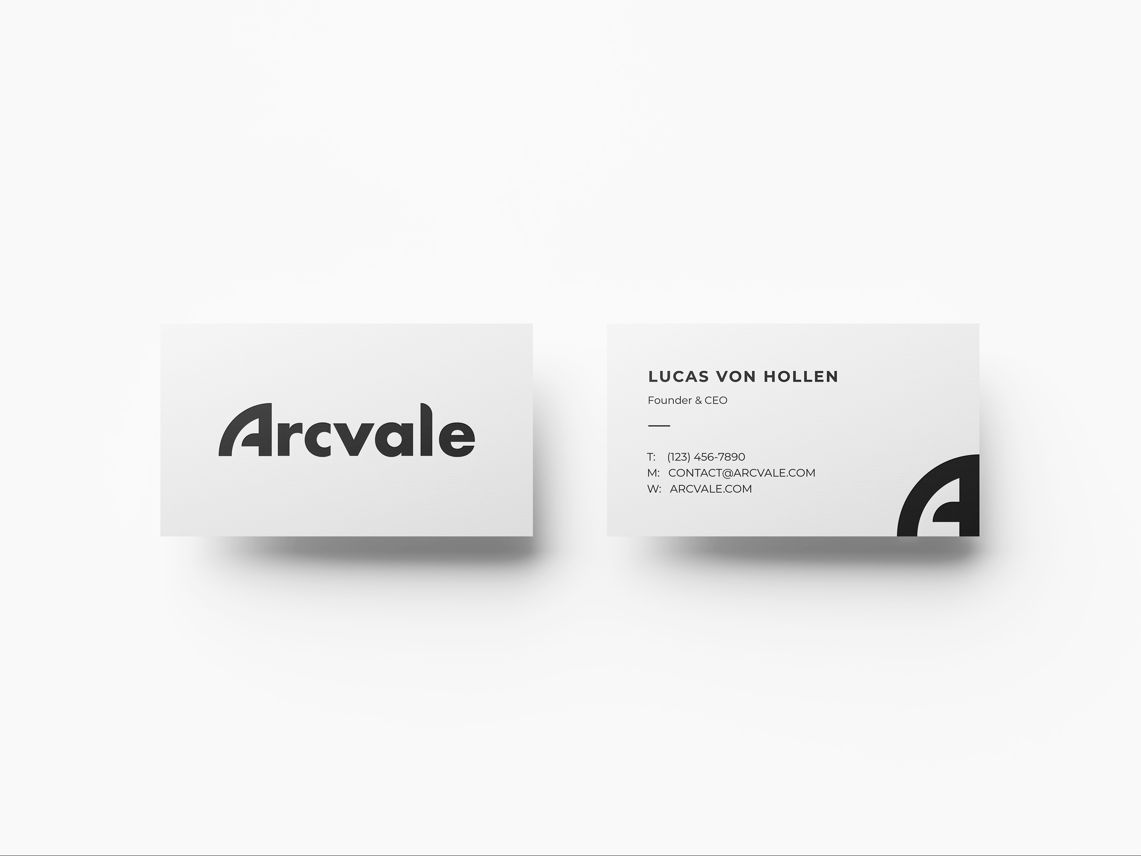
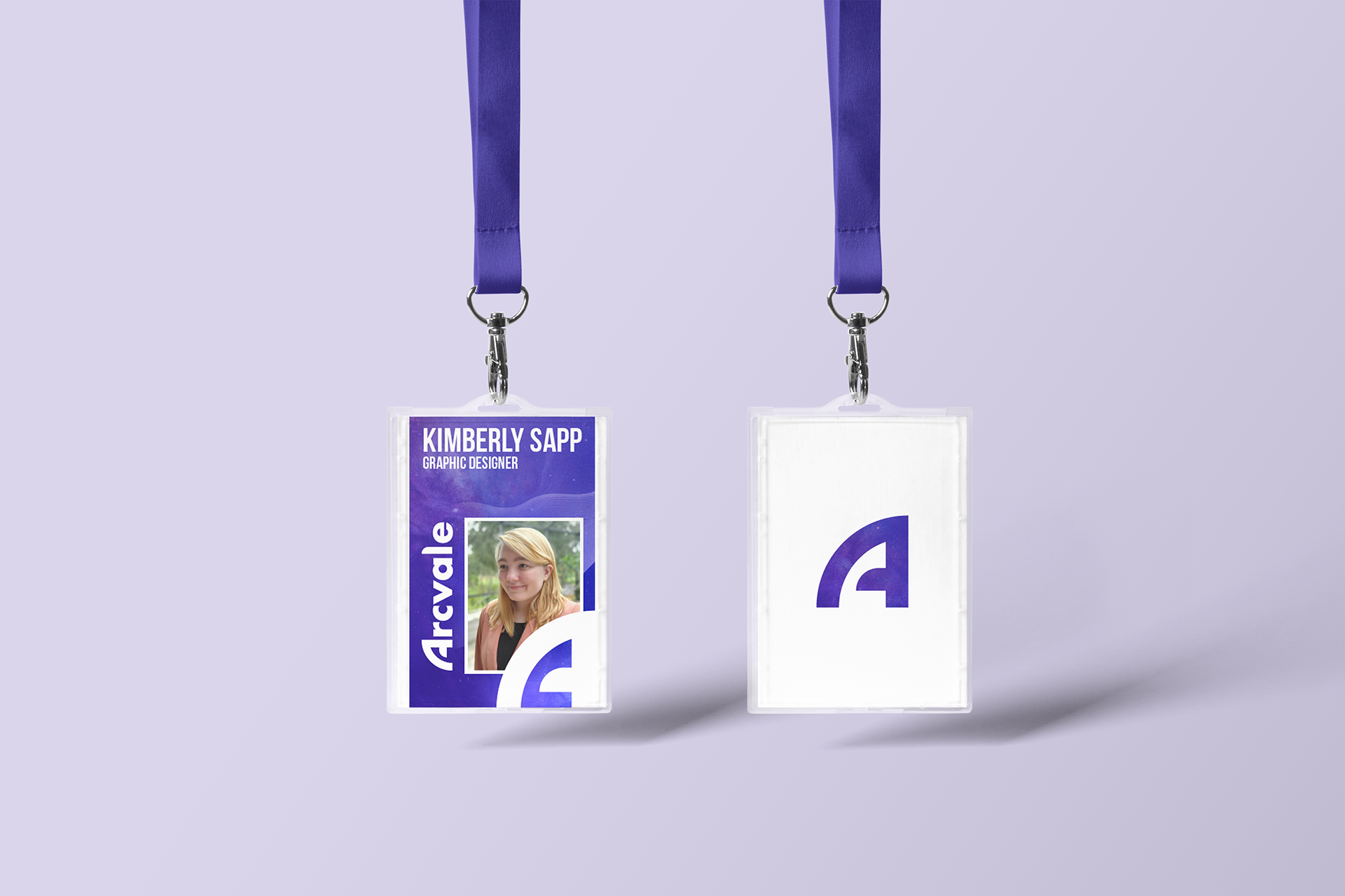
Arcvale Business Card
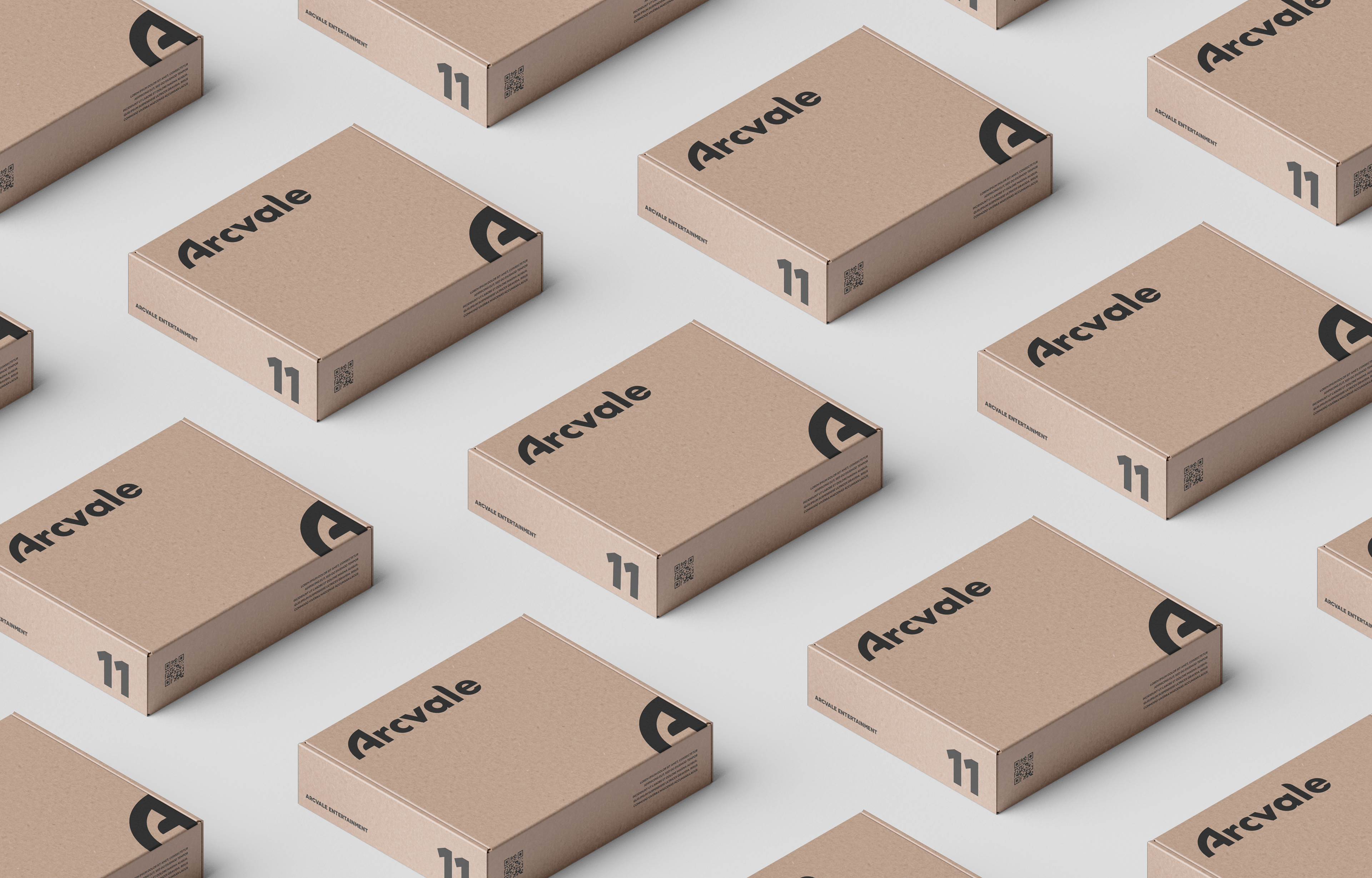
Arcvale Product Packaging
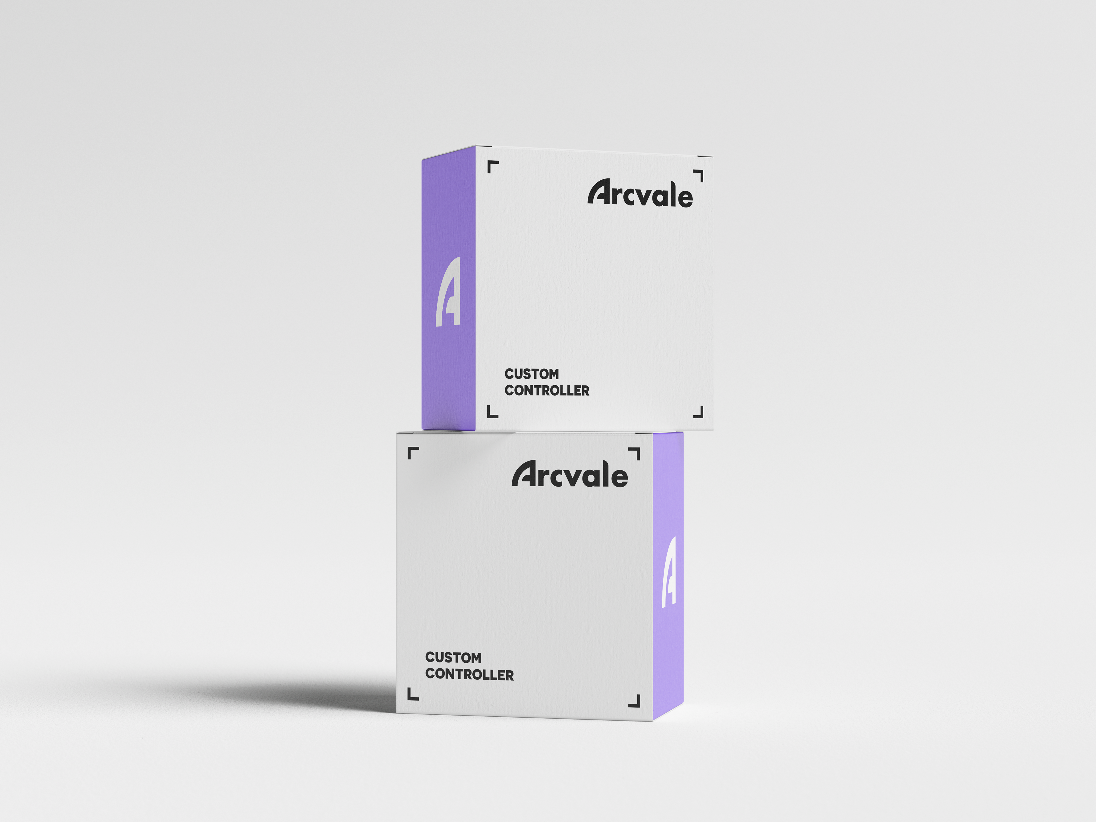
Arcvale Product Packaging