Title - Slide 1
Main Logo - Slide 2
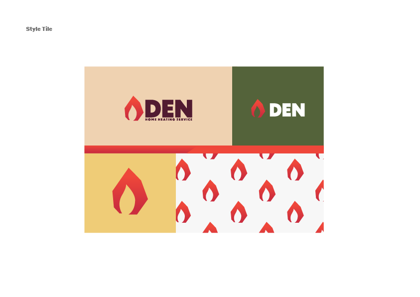
Style Tile - Slide 3
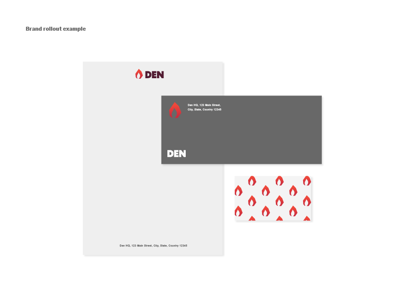
Brand Rollout Example - Slide 4

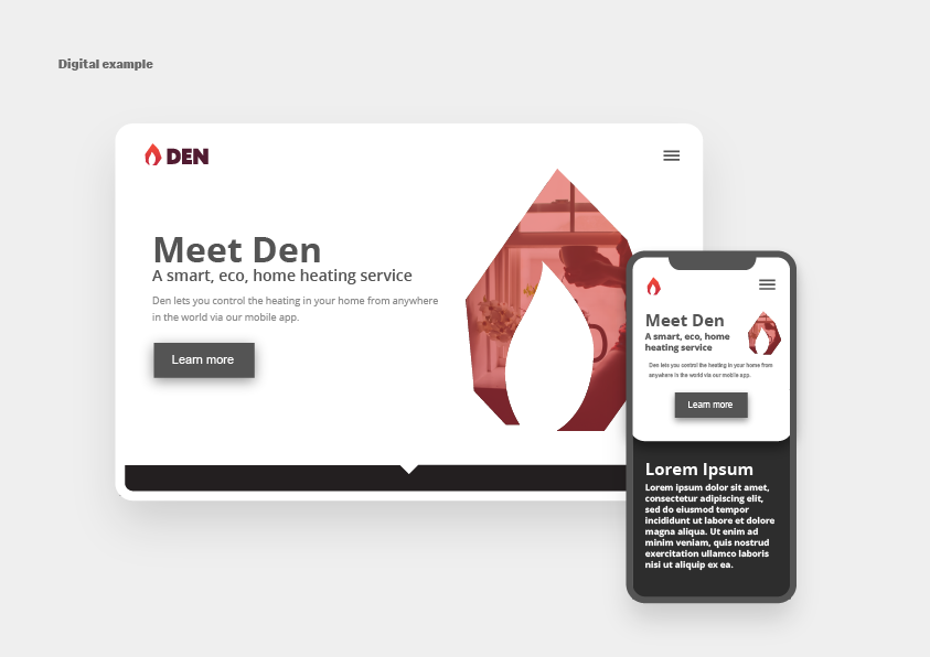
Digital Example - Slide 5
Objective (Mock brief from Briefbox)
Den is an eco energy company who are developing a state of the art system that lets you control the heating in your home from anywhere in the world via a mobile app. As Den is looking to break into the homeowners market, they want a brand that will identify them as family friendly, trustworthy and as an eco-friendly alternative to other mainstream companies. Market research has shown that their main audience will be homeowners from the younger generation who are looking to make a difference to the planet, so the brand should be appealing to an audience in their late 20s-30s.
The Process
I began this journey by taking a look at the creative direction provided to me by the client.
Creative Direction
Creative Direction
Creative Direction
Creative Direction
Creative Direction
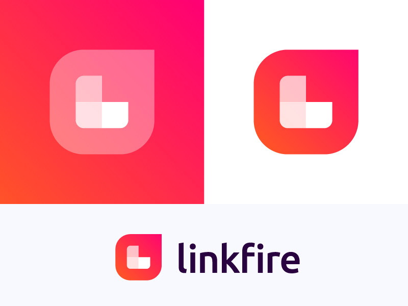
Based on Den's goals and the creative brief, I gathered that the designs I make for this brand should try to utilize bright colors, symbol(s) for the logo, san serif font, and subtle gradients.
For this project, I began with the logo and thought about different symbols that could be used to represent a home heating service. After considering a few different symbols such as a home or a chimney, I decided to stick to the idea of fire as a symbol for the brand.
For this project, I began with the logo and thought about different symbols that could be used to represent a home heating service. After considering a few different symbols such as a home or a chimney, I decided to stick to the idea of fire as a symbol for the brand.
I wanted to stay away from a more realistic approach to the fire, as it would add complexity and age the brand. I ended up going with a blocky fire symbol in order to preserve a youthful feeling, appropriate for the target audience of 20-30 year olds. Dunbar was selected as the font of choice for Den's logo. It is a bold san serif with a little bit of personality. For the tagline "home heating service", I played with some serif fonts such as Sitka, but decided on sticking with Dunbar. Doing so maintained the youthfulness that a serif would jeopardize.
Once the logo was created, I went ahead and created the style tiles, which works to display the different ways the brand could be presented. The earthy colors were chosen to align with the eco-friendly nature of the brand. These colors were reeled back a bit in terms of brightness in order to hold on to a bit of maturity that comes with homeownership. Finally, a pattern was created using the fire symbol of the logo.
The last step of this project was to create examples of the brand being used in real-world environments. Brand assets were applied to stationary, a web landing page mockup, and a mobile mockup. The stationary was designed to remain simple while still recognizable. The web and mobile mockups utilized the brand assets as well as outside imagery. The photograph brought in for the digital example places the brand in the real world and was chosen to give a feeling of coziness, that Den promises to bring to homeowners with their technology. The image was placed within the fire symbol with a red gradient overlay to follow a design trend in the world of web design.

Brand Rollout Example - Slide 4
